Sisense
For Cloud Data Teams
Unlock the Power of Your Data with the All-New Sisense for Cloud Data Teams! Seamlessly connect to any cloud source, explore insights, and build powerful analyses faster than ever.
Used By:

Add Multiple Blocks
Sisense for Cloud Data Teams makes data analysis more interactive and flexible than ever. Work with massive datasets, write live code in bite-sized, executable blocks, and experiment on the fly. No more clunky workflows—just fast, smooth, and seamless exploration!
Iterate On Ideas
Data Storytelling
The Beginning
In 2019, Sisense, a no-code analytics platform, acquired Periscope Data for $174 million. Periscope Data, designed for data analysts, enabled users to explore data, write SQL queries, and create reports and dashboards. The acquisition expanded Sisense’s reach, offering both data analysts and business users a unified platform that seamlessly integrates data modeling, visualization, and both code-first and no-code analytics.
The Background
As Lead Product Designer at Sisense, I led the integration of Periscope Data post-acquisition, driving design strategy and user research to evolve the platform experience. I worked closely with customers, co-founders, senior leadership, and cross-functional teams to deliver a redesign aligned with business goals. I defined the end-to-end design vision, built scalable design systems, and promoted a user-centered approach across teams. I also mentored designers, strengthened design culture, and partnered with engineering and product leads to ensure high-quality execution. These efforts boosted adoption of advanced analytics features and reinforced Sisense’s leadership in data visualization and BI.
My Role
Lead Product Designer. Developed strategies to align business objectives, collaborated with product managers to drive goal alignment, led user research, tested and validated designs, and shaped the overall user experience to create a seamless, intuitive, and user-focused product.
Goal
Leverage the $174 million Periscope Data acquisition to integrate it into Sisense, identify core user needs, and develop a new product that enhanced the analytics experience while retaining existing customers, and expand market reach to attract new users.
Defining Scope & Success
Before starting research and design, I collaborated with key stakeholders to define the project scope and success criteria, ensuring alignment on goals and establishing clear metrics to measure success post-launch. This foundation provided a shared vision and informed key decisions throughout the design process. These core drivers shaped my design approach.
Business Success
Convert 70% of Periscope Data customers while expanding market reach, attracting new users, and driving engagement and adoption.
Design Success
Create user experience focused on user needs and adoption. Develop features to enhance user workflows and improve efficiency.
Design Strategy & Research Plan
To kickstart my design initiative, I began by building context through meetings with key stakeholders, including product managers, directors, and senior leadership. My goal was to understand the business objectives behind the acquisition, align on overarching goals, and establish clear success metrics. Next, I focused on gaining insights into user needs by examining what users loved about Periscope Data, what they disliked, what was missing, and how analysts used the platform in their day-to-day workflows. Below are some of the research and design methods I employed to shape my approach.
Research Methods
Moderated Remote Testing
Observations
1-on-1 User Interviews
Surveys
Design Methods
Concept Sketching
Wireframes
Low-fidelity Design Mocks
High-fidelity Design Mocks
Who We’re Designing For
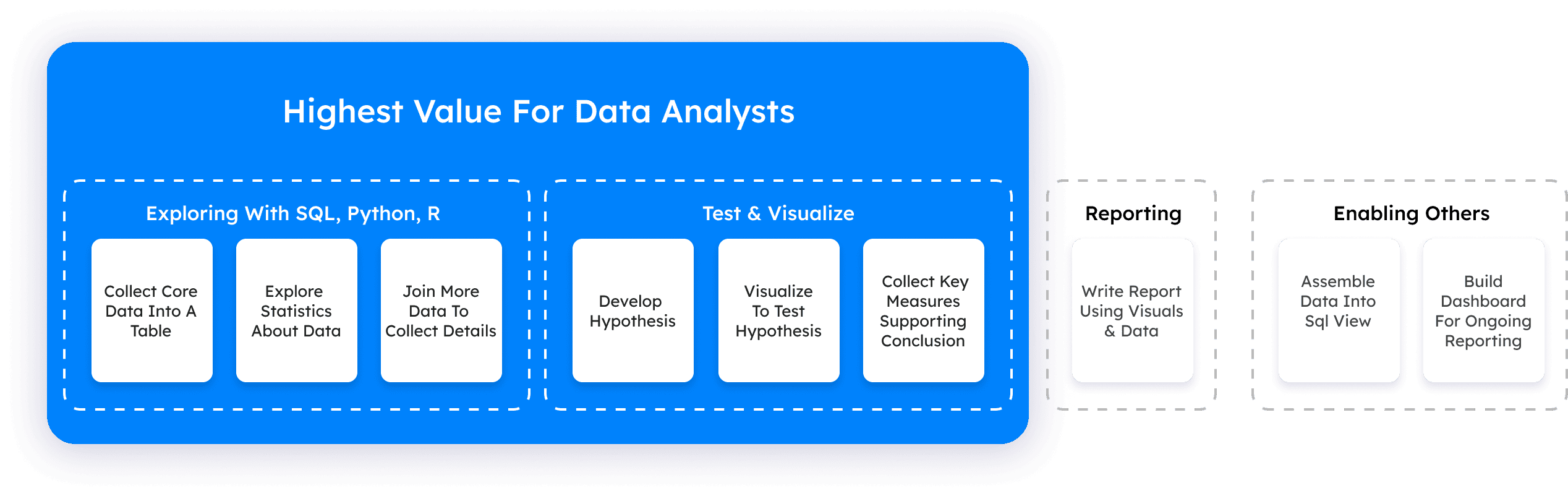
Understanding who our users are and how they interact with Periscope Data is key to building the next phase of the platform as we phase it out and integrate it into Sisense. Periscope Data serves three main user groups: data engineers who build infrastructure, data analysts who interpret data, and business users who make decisions. Our primary focus is on data analysts, as they are the product’s main users and the primary buyers of the tools they use for their analysis.
What’s A Data Analyst?
A data analyst collects, processes, and analyzes data to help organizations make informed decisions. They use coding languages like SQL and visualization software to identify trends, patterns, and insights. Data analysts often create reports, dashboards, and conduct ad hoc analysis to support business strategies and solve problems.
An Analyst’s Journey
Understanding the user journey allows me to analyze behavior, identify gaps, and uncover pain points. Interviews with data analysts revealed that they spend a significant portion of their time writing SQL, testing ideas, refining concepts into a final codebase, and visualizing insights in charts for stakeholder reports. A major pain point was the difficulty of generating and validating new insights on the old Periscope Data platform—an issue left unaddressed before Sisense’s acquisition. This limitation hindered analysts’ ability to iterate quickly, test ideas, and develop new solutions to solve complex problems, all of which are crucial for producing accurate and impactful reports.
Click to see full screen
Pain Points Discovered
The user journey revealed that data analysts spend countless hours testing and refining new ideas to improve their analysis. However, the lack of proper support for testing, refining, and iterating on ideas; makes their process of generating impactful reports more complex. Analysts also encounter other obstacles throughout their analysis journey, adding to the challenges they face. Here are the pain points identified throughout the analysis process:
Testing
No in-product testing & iterations.
Searching
Finding relevant datasets using keywords & filters.
Extraction
Gathering data for use or for integrations.
Organization
Cleaning, categorizing, & formatting data.
Tracking
Losing track of past experiments.
Opportunities
Through user observation and research synthesis, I identified key opportunities to improve the analysis process. These insights, not explicitly mentioned by users, came from understanding their behaviors and pain points. In addition to challenges with analysis, analysts often struggle with presenting data as a compelling narrative, structuring insights effectively, and breaking down complex analyses into smaller, digestible pieces for specific requests. The goal of these opportunities is to enhance and empower analysts’ ability to produce more meaningful and insightful analysis, both for themselves and their stakeholders. Below are a few key opportunities essential for shaping this new user experience:
Iterations
Support the iteration process to speed up analysis.
Streamline
Simplify analysis to enhance clarity and speed.
Micro-Analysis
Support bit-sized analysis for quick decision making.
Storytelling
Craft data stories with images, videos, & text.
Defining The Problem & A Path Forward
The old Periscope Data platform faced several challenges, making it crucial to prioritize the right problems. The primary focus is enabling in-product testing through continuous iteration. To ensure clarity and alignment, I defined a Problem Statement that articulates our core challenge. Additionally, I crafted a How Might We Statement to reframe the problem as an opportunity, guiding my design decisions and helping my product team stay focused on a clear path forward.
The Problem
Analysts lack the ability to test and refine their analysis directly within the product, making report creation a lengthy and cumbersome process. This absence of in-product testing slows workflows, increases errors, and prolongs the time needed to deliver actionable insights.
How Might We
Create a flexible code editor that lets analysts easily iterate on multiple ideas in one environment, boosting experimentation, collaboration, and faster concept refinement to accelerate the reporting process.
The Design Phase
The design phase was driven by the users’ difficulty in testing and refining their analysis directly within the product. With this in mind, my solutions were centered on creating an environment that enables analysts to explore different ideas, test them, and refine their findings. In addition to tackling the primary challenge, the goal was to improve the overall workflow by introducing features that support the creation of micro-analyses and assist analysts in crafting clearer, more engaging narratives around the data in reports. My design process began with developing low-fidelity wireframes to test and refine the overall design direction with users, before progressing to high-fidelity designs using Sisense’s design system. Once a direction was validated through user feedback, I applied the design system, utilizing UI components, colors, and elements to create a more polished, realistic version of the design. All designs were tested through interactive prototypes, allowing users to experience vital interactions, and providing a more immersive feel. This approach enabled testing of both primary and micro-interactions, essential for fine-tuning the user experience. It also provided critical feedback to ensure the design remained focused on user needs and objectives.
Wireframe 1
My initial design direction explored a multi-window approach to analysis. Analysts could query a database, write code, and generate charts to test their hypotheses. If further iteration was needed, they could minimize the current test into a dock and open a new window to start a new analysis. At any time, users could access their minimized analysis to compare and contrast past experiments. However, user testing revealed a strong preference for consolidating all iterations within a single screen. This feedback informed the next iteration of the wireframes, shown below.
Click to see full screen
Wireframe 2
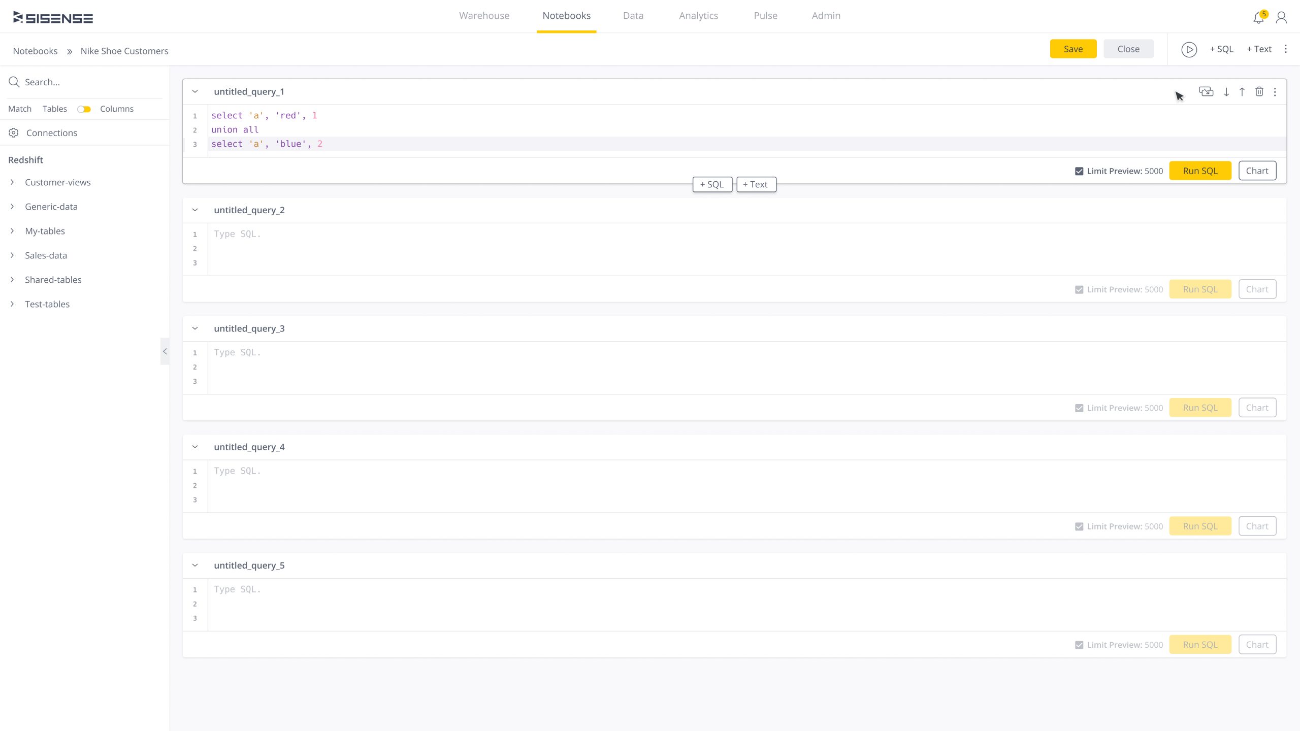
Based on user feedback, I redesigned the analysis workflow to fit within a single screen. I introduced a block-based structure that allows analysts to write and test code in individual segments. This approach supports an iterative workflow, enabling users to reference past attempts and expand on previous ideas by adding new code blocks. User testing revealed that analysts preferred this design for its ability to seamlessly build new ideas from past experiments. With strong positive feedback, the block structure became the foundation of my final design.
Click to see full screen
Final Block Layout
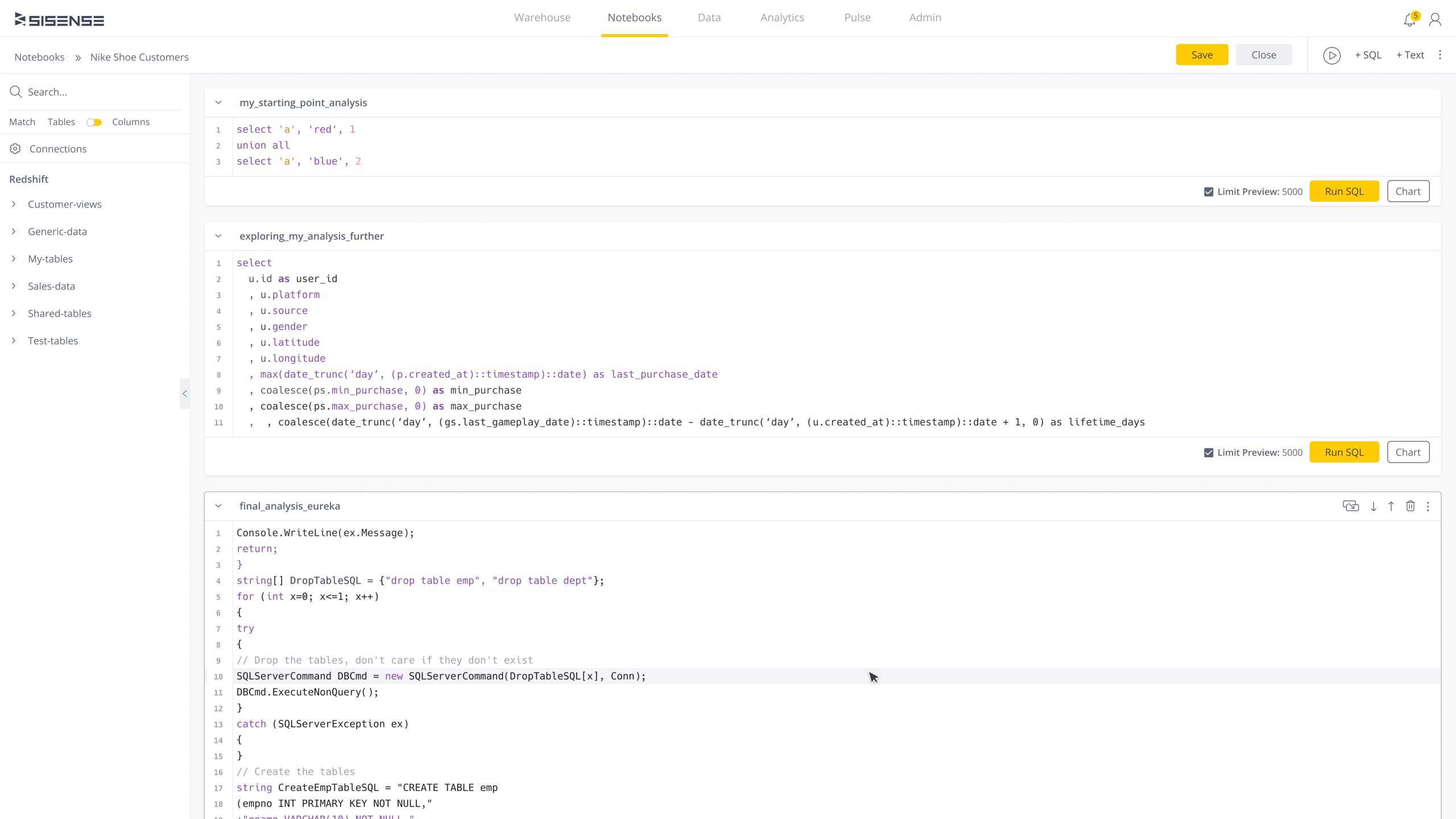
In the final block-based structure, I enabled users to create new code blocks within existing blocks and leveraged Sisense’s design system for higher-fidelity testing, offering a more realistic look and feel. Previously, adding a block required using a button in the header, which disrupted the workflow and made block placement unclear. By incorporating CTAs within each block, users can now easily add new blocks in context, enhancing clarity and efficiency.
Click to see full screen
Text & Images
The block structure allows users to insert code, text, images, and links, making the content more engaging. By clicking the “Text” CTA button within a block, users can access the WYSIWYG (What You See Is What You Get) Text Editor, commonly found in word processors, email platforms, and web-building apps, to format text and insert images in real time. The ability to seamlessly integrate various media types within the same block enables analysts to craft more dynamic and comprehensive data narratives.
Click to see full screen
Sharing & Collaborating
Sharing with stakeholders and collaborating with other data analysts is essential for informed decision-making and effective teamwork. To share an analysis, users click the “more” icon (three dots) and choose the share option. They can assign “View” mode for stakeholders to simply view the report, or “Design” mode for editing. If “Design” mode is selected, the analysis is sent via email for edits. Once changes are made and returned, a toaster notification prompts users to refresh the page, where the updates are displayed in a new block with the editor’s name and timestamp. Users can then execute the provided code and integrate it into their analysis.
Click to see full screen
Success Metric
After launching this new experience and evaluating usage data over multiple quarters, the redesigned experience outperformed the previous Periscope Data platform. By framing analysis as an iterative process—testing ideas to uncover insights—while enabling analysts to create compelling data narratives with images, text, and video, the new design fostered more impactful analysis for analysts, improved understanding of reports for stakeholders, and increased collaboration across data teams. Ultimately, this led to higher user satisfaction, more effective data-driven decision-making, and the successful replacement of Periscope Data.
Conversion Rate
82
Increase Report Speed
63
Increase Satisfaction
55
Want to learn more
about this case study
or others projects?
For details on my design process or collaboration opportunities, feel free to get in touch!